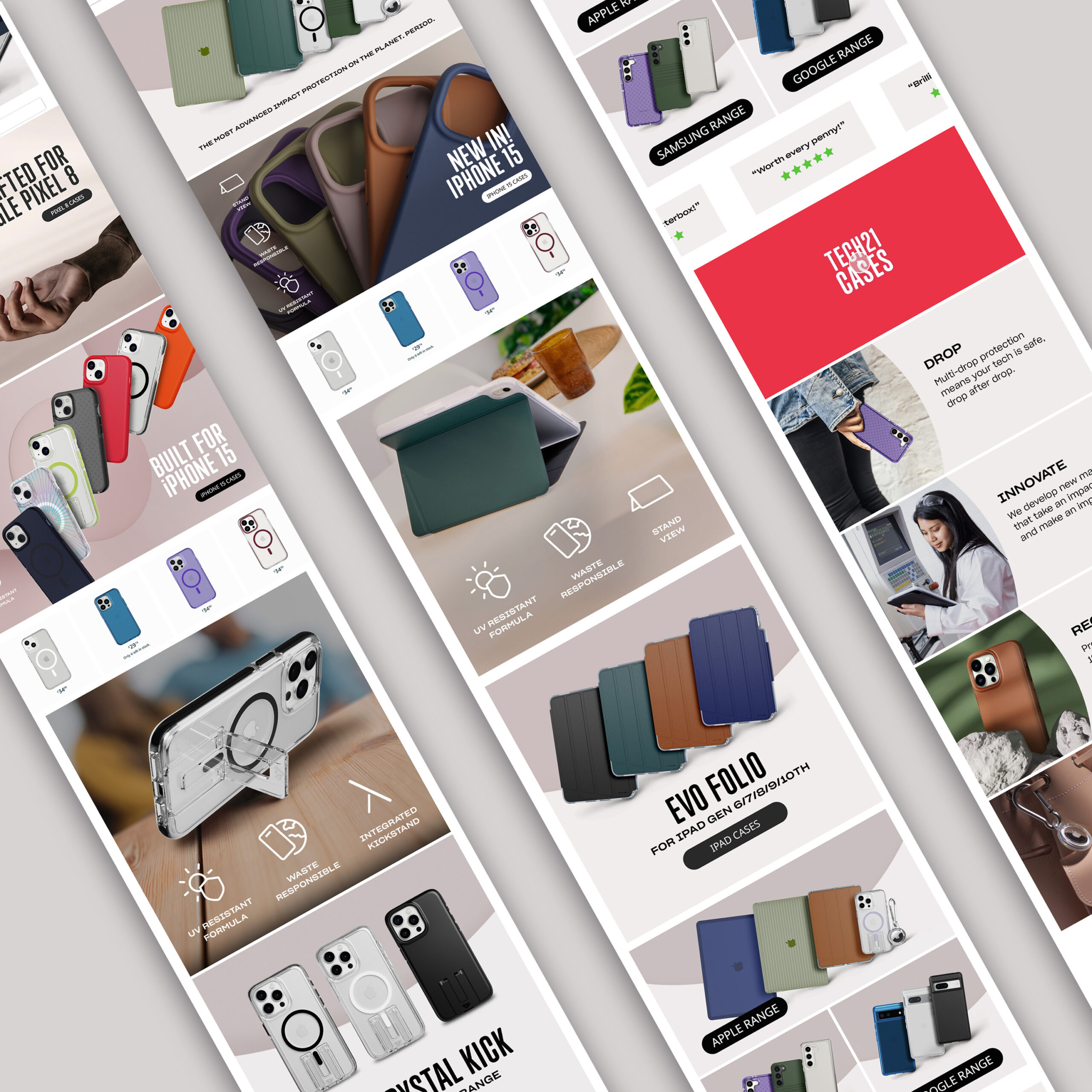
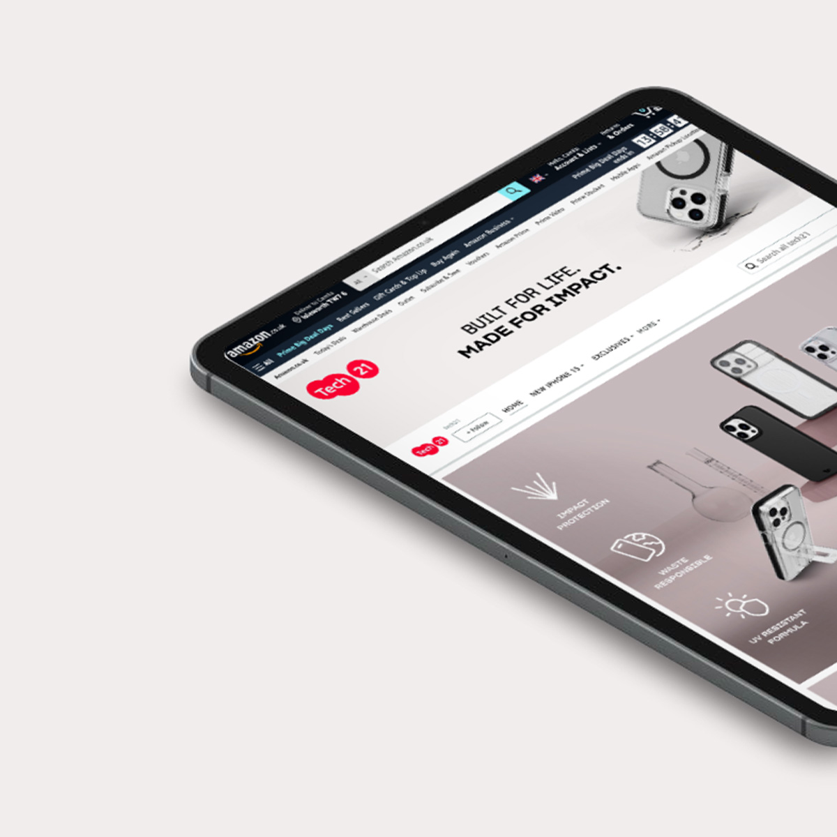
Tech21 Amazon's
E-commerce platform redesign
Research | Analysis | Wireframing | Workshop Facilitation | Stakeholder Management | Information Architecture | Brand and Design Framework | Guideline and Template development
Problem statement:
The current Tech21 Brand store on Amazon poses challenges for both consumers and our team. It's outdated, hard to navigate, and leads to a frustrating user experience. We require a more structured layout to support the rollout of our launches and new products efficiently.
Objective:
Understand business requirements and develop a system to revamp the Tech21 Brand Store on Amazon. Prioritise workflow, design, content, and navigation enhancements to improve the user experience and boost conversions, supporting both team functionality and design objectives.
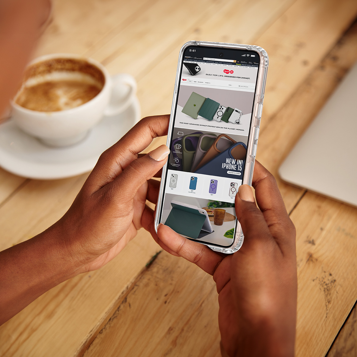
Challenge
How to improve the Amazon Platform with minimal designer input?
Client
Tech 21's Amazon
E-commerce Platform + Amazon consumers
Role and Team
UX Designer
Content Manager
Amazon Manager
Creative Design Lead
Timeline
End-to-end process:
Project took 5 weeks
to be completed

Empathise: Understanding the Problem
In this project, my key responsibility was bridging the gap between the Amazon team's requirements and the Studio's constraints. Through effective workshop facilitation, I gathered input from all stakeholders, allowing me to define the internal challenge and develop a solution mindful of the current business environment during the page redesign.
These workshops played a crucial role in maintaining team cohesion, providing each member with a platform to contribute insights from their unique perspective. By fostering a collaborative environment and involving all stakeholders in content planning and design decisions, I ensured their buy-in and collective success in the project.
Research Goals:
• How can we assist the business in building and maintaining brand awareness and presence on Amazon?
• How can we assist the business in creating and maintaining brand guidelines for their Amazon shop?
• How can we reduce costs and streamline the process of asset creation on Amazon?
• How can we enhance conversion rates on the Amazon page?
• How can we create an effective structure and layout for the Amazon shopfront?
Research Methods:
- Desk Research:
Amazon articles on how to display products on Amazon pages
- Workshops with stakeholders
- Competitive Benchmarking

Identifying the internal challenge: Insufficient design capacity
In addition to helping the team identify business goals, the workshops mentioned above provided us with great insight: With the design team stretched thin, operating at full capacity, and often relying on freelancers to manage high workloads, I addressed the pressing issue of a shortage of designers dedicated to Amazon-specific projects.
To ensure effective solutions, I aligned user issues with business objectives, drawing insights from traffic and competitor analysis. Simultaneously, I addressed internal challenges by applying design principles to streamline the processes.
Business Goals
1. Improve User Experience
Comprehensive redesign from both a navigation and build perspective, as well as a content and branding standpoint.
2. Build Brand Awareness
Educate new consumers and improve Brand awareness and credibility as the Brand evolves.
3. Improve Sales
Consistently showcase new releases and best-selling products, capturing user attention and driving sales.
4. Cut costs/time
Streamline creative asset production cutting costs and time spent on asset creation.
Competitive Landscape
I analysed our competitors, evaluating their strengths, business strategies, and potential shortcomings. Additionally, I explored brands beyond our industry, ranging from well-known to smaller ones, to gather innovative ideas.
Our collaboration with the Amazon team highlighted that customers visiting Amazon aim to comprehend a product and its distinctive features, read reviews, and gain deeper insights. Our main objectives were to enhance the credibility and identity of our brand, ensuring effective communication of the product's key selling points.
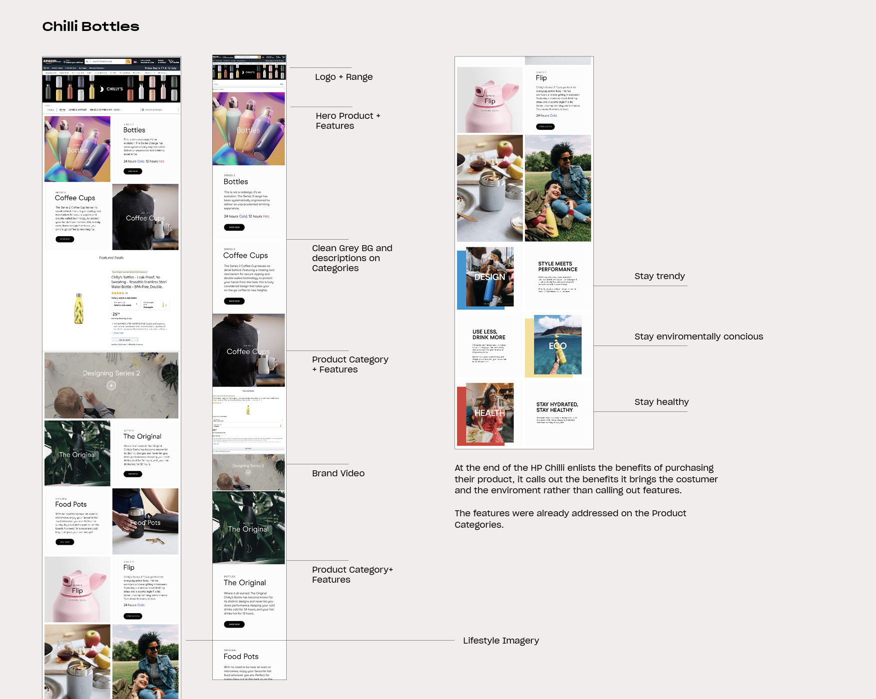
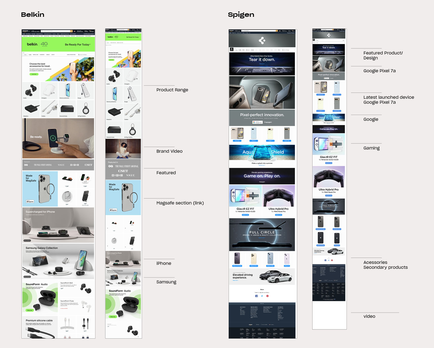
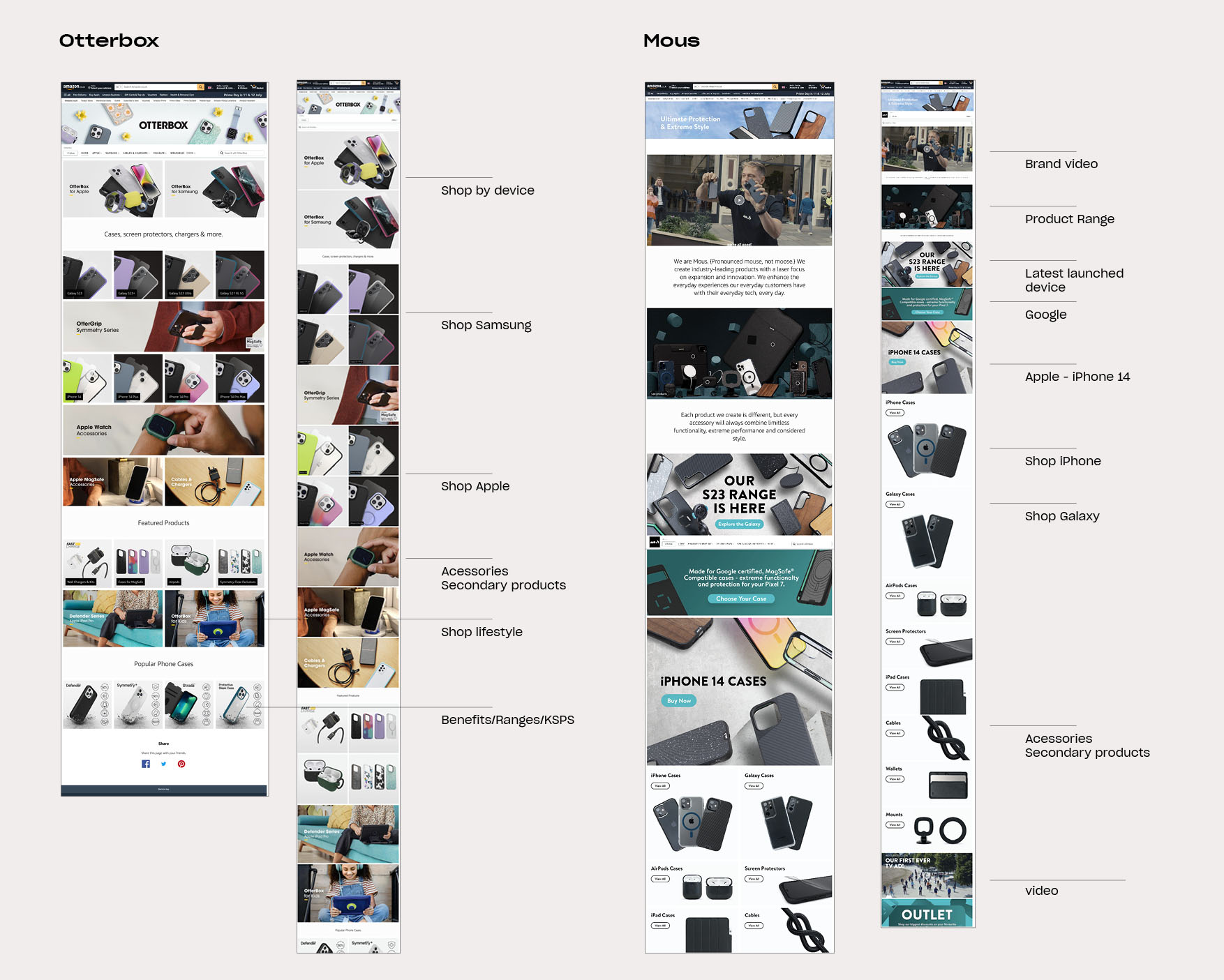
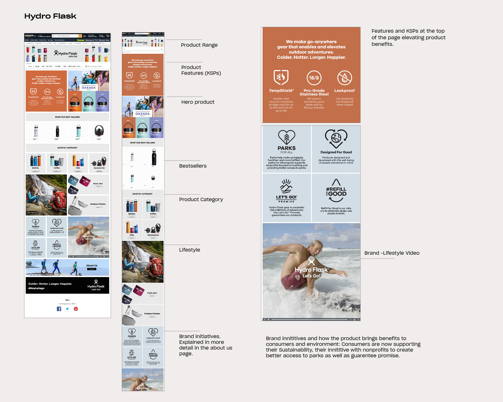
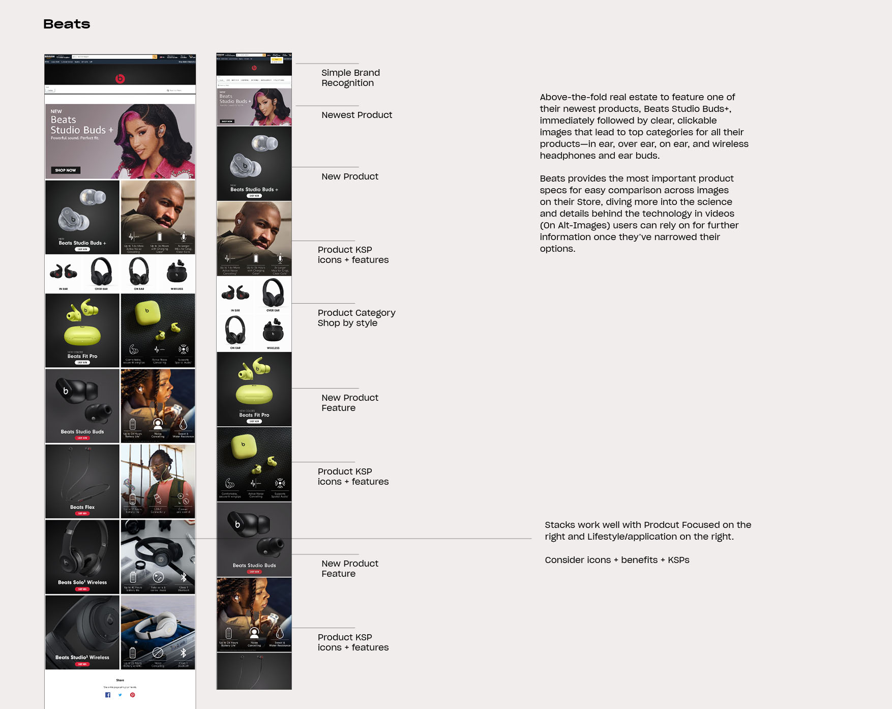
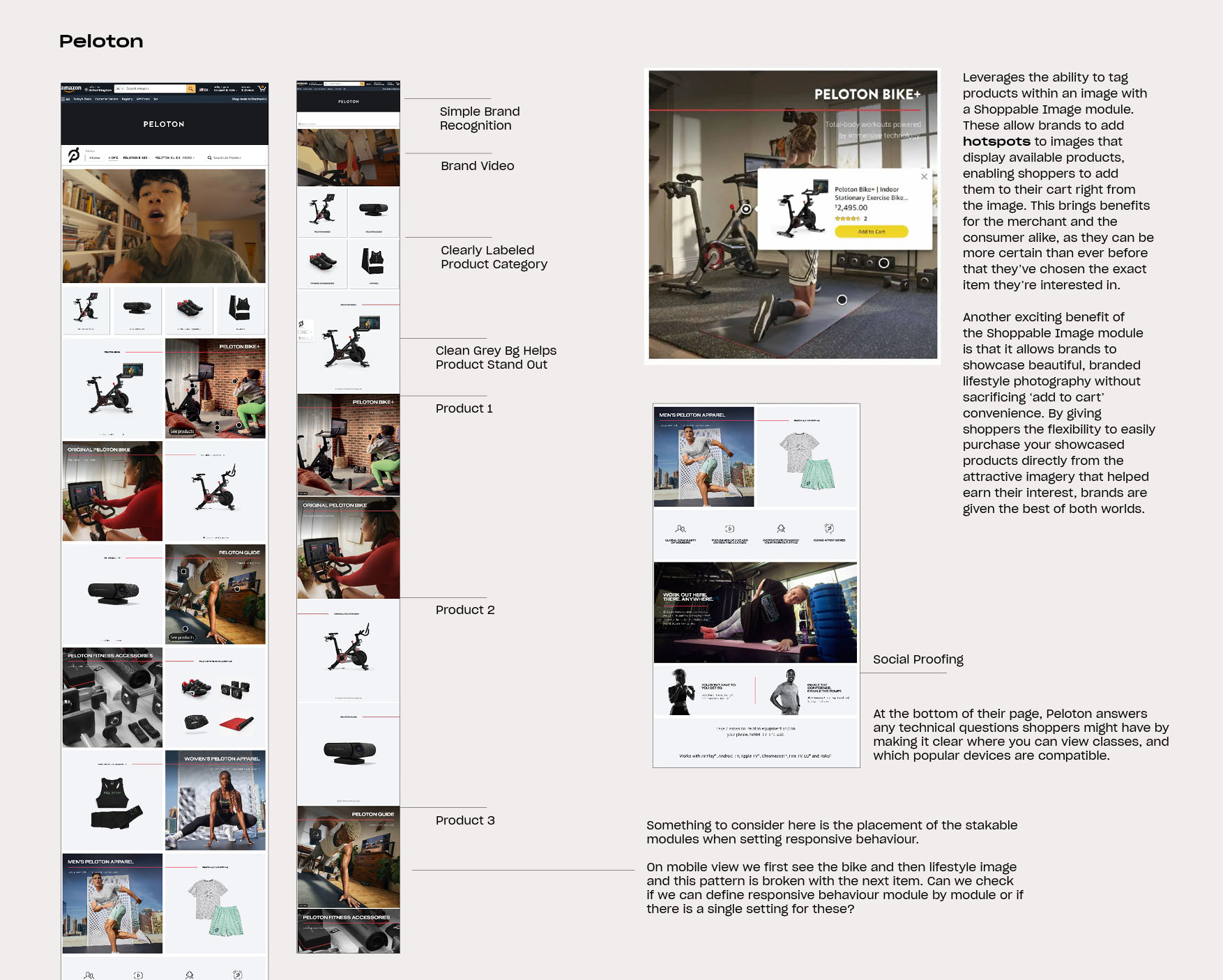
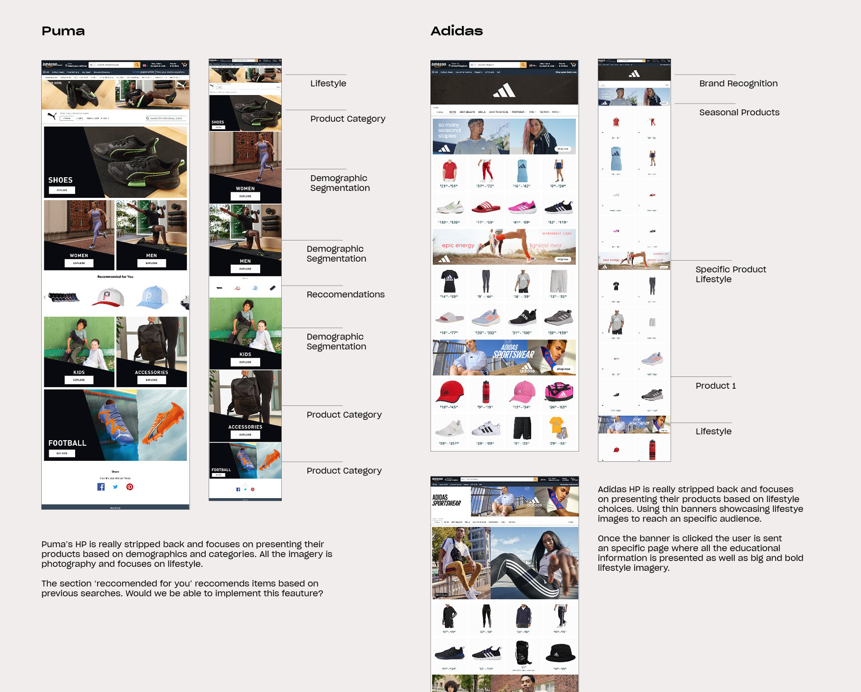
Competitor/Retailers research
Competitive Benchmarking: Main Insights
• Optimal use of modules - Templated modules for effective display on both mobile and desktop viewports, prioritizing stackable modules for responsive design.
• Engaging and varied imagery - Striking a balance between product-focused and lifestyle imagery is essential to highlight product features while evoking emotions.
• Social Proofing - Reviews on Amazon pages serve as social proof, reinforcing brand credibility by showcasing real user experiences. Positive reviews influence purchasing decisions, building trust and driving sales.
• Visuals showcasing the benefits - Shift the focus to social and environmental benefits over product features, to highlight relatability and emotional appeal, ultimately boosting brand awareness and conversions.
Fostering Emotional Connection
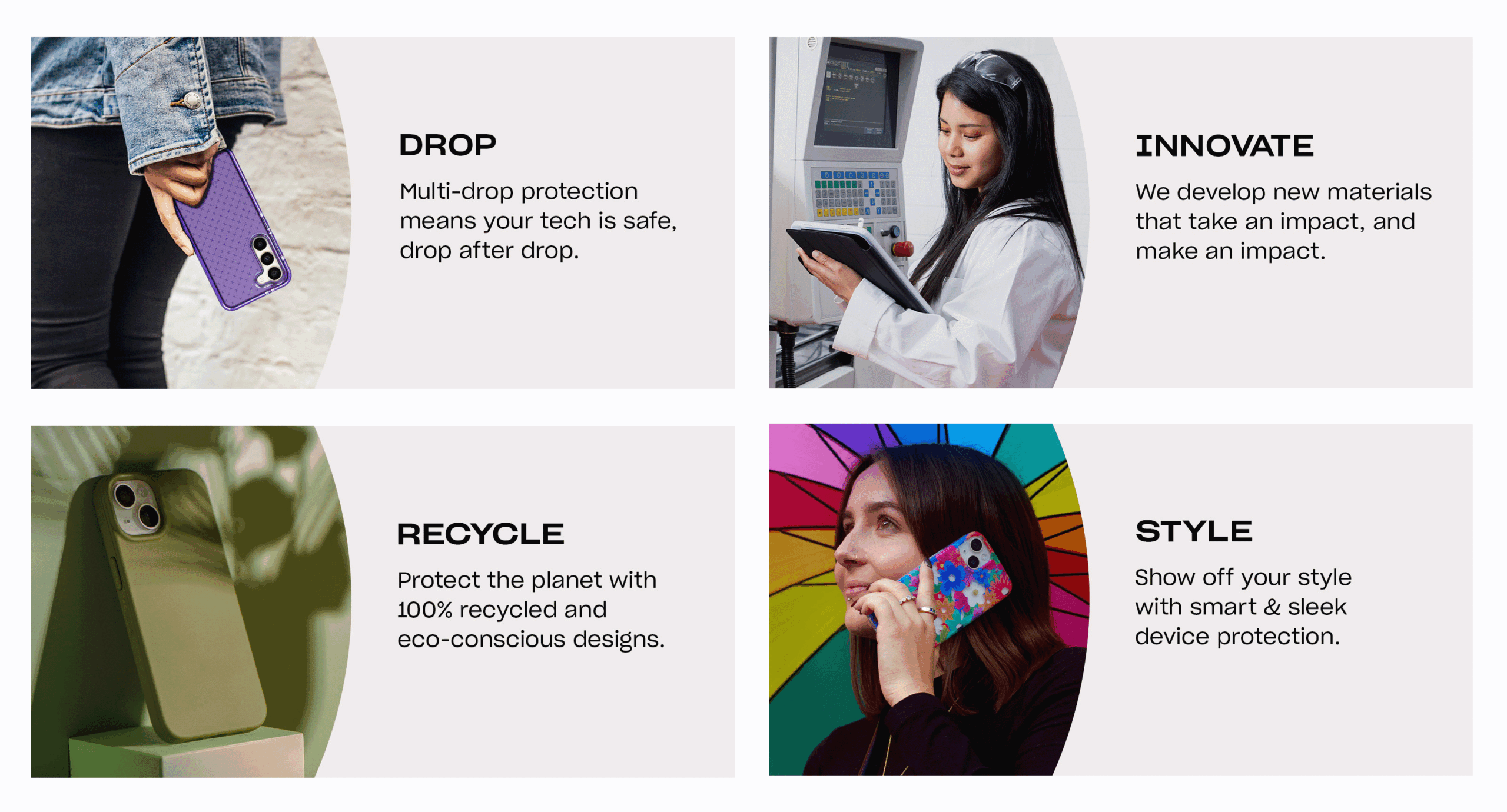
My desk research revealed the substantial influence of emotional elements on the ultimate purchasing decision. To tackle this, I implemented a dedicated section emphasizing the benefits our products bring to consumers and the environment, surpassing mere feature descriptions. This strategy enables customers to establish a deeper, more emotional connection with our brand and products.
Navigation
Analysing traffic data, we found that specific device pages, especially the home page, draw the most visitors. This presents an opportunity to consolidate traffic for a smoother customer experience and reduce disengagement risks.
Given that a majority of Amazon users access the platform via mobile devices, adopting a 'mobile-first' approach was crucial. My analysis of the user journey and site navigation identified key areas for improvement.
This highlighted the need for a central brand educational page and optimized product listings, ensuring a user-friendly Amazon experience tailored to the mobile-first user base without compromising the desktop layout.
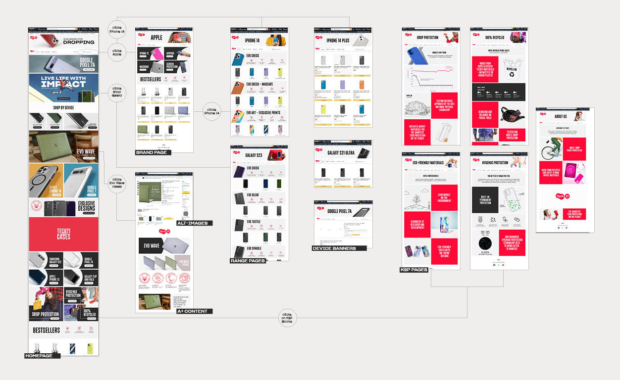
By incorporating these insights and enhancements, my aim was to create a more seamless journey for consumers. This ensures they can effortlessly explore the brand and find the products they desire, with a primary focus on improving user satisfaction and engagement on the platform.
The new Amazon Tech21 Brand store
provides a seamless and
user-friendly shopping experience, effectively showcases products,
drives sales, reinforce
the brand’s positioning as
a leader in impact protection.

Ideating: Wireframe Iterations
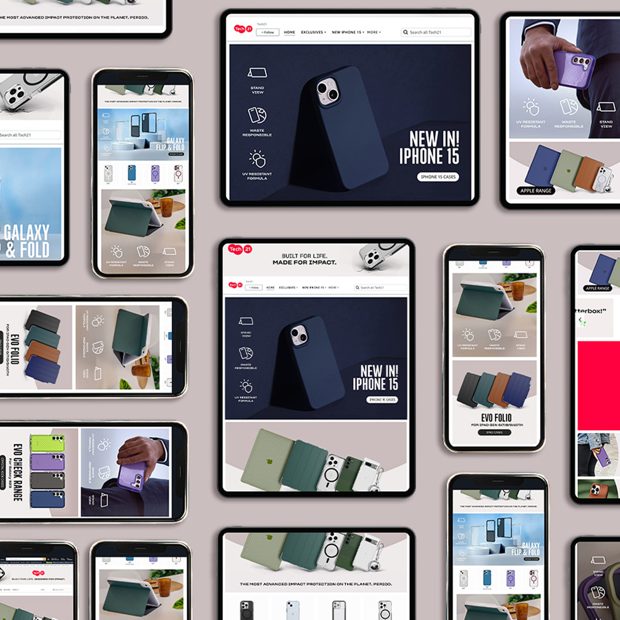
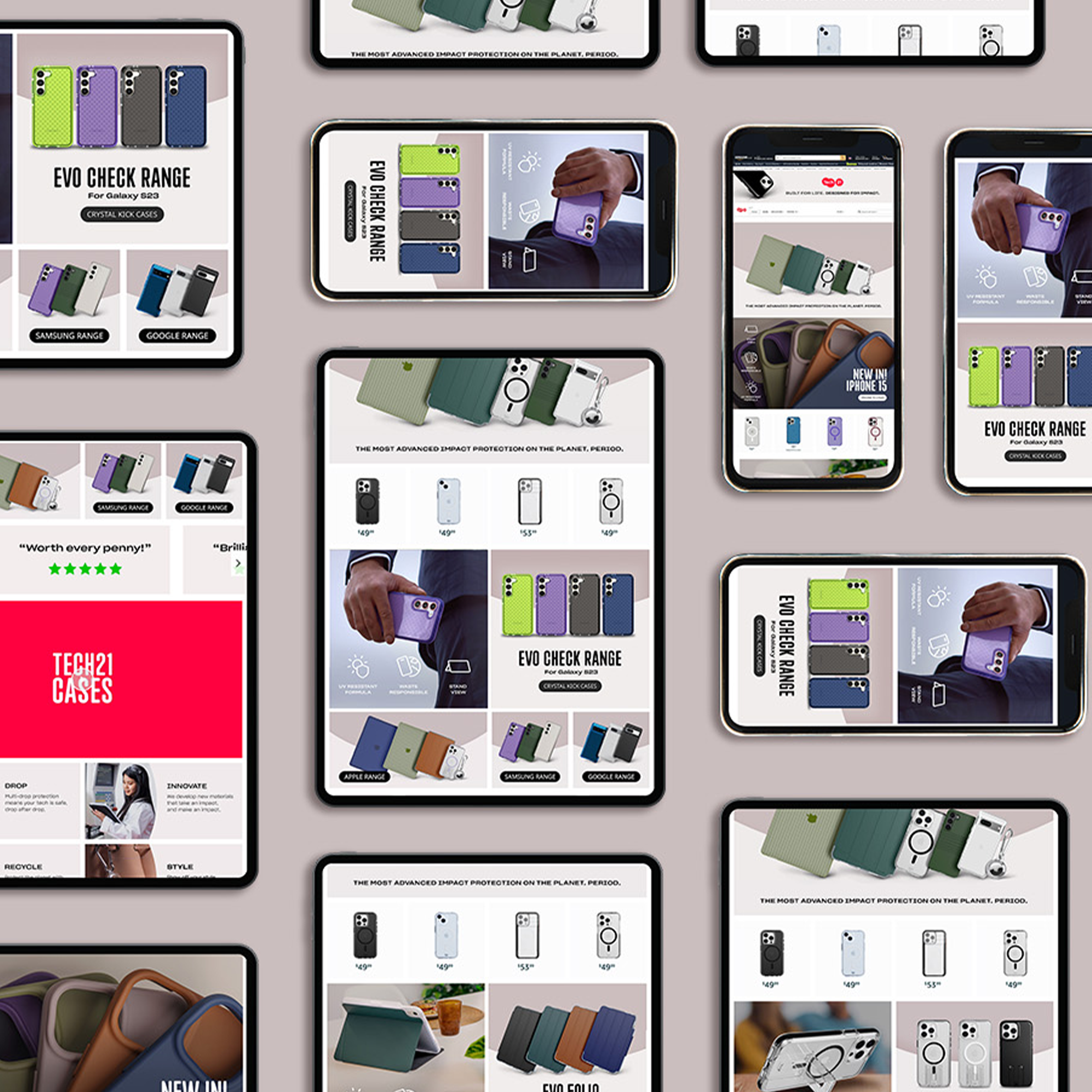
The next step involved optimising the use of the platform's blocks and modules. These components are inflexible, and the platform lacks separate mobile or desktop versions. My challenge was to select and create layouts that function seamlessly on both mobile and desktop, relying solely on the platform's responsiveness.
In collaboration with the Amazon team and Content Manager, we engaged in multiple iterations to define content hierarchy and develop a structure capable of accommodating ongoing content changes, including product launches and seasonal campaigns.
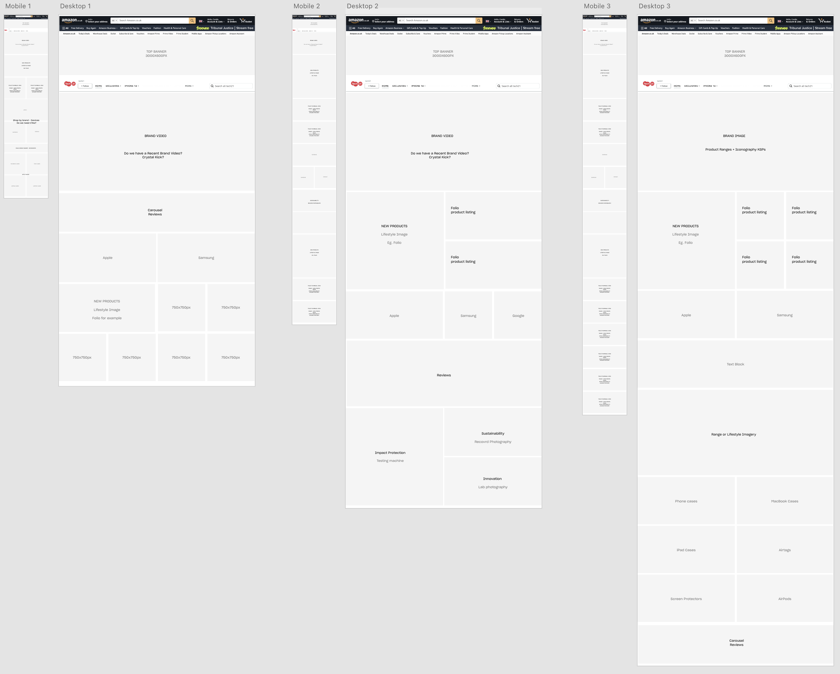
Iterations
My primary goal was to establish a framework and layout structure for the pages, ensuring a systematic approach that the Amazon team could easily follow when modifying content. This approach aimed to streamline the user experience across all devices while facilitating efficient content management.
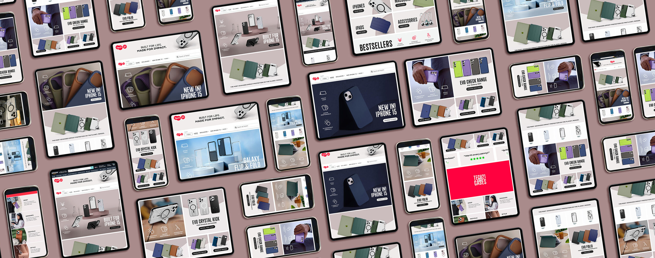
Following layout experimentation, we adopted a versatile design highlighting the Brand concept and new products. This layout enhances content hierarchy which works seamlessly on both mobile and desktop and can be easily edited to suit the new product launches and campaigns.
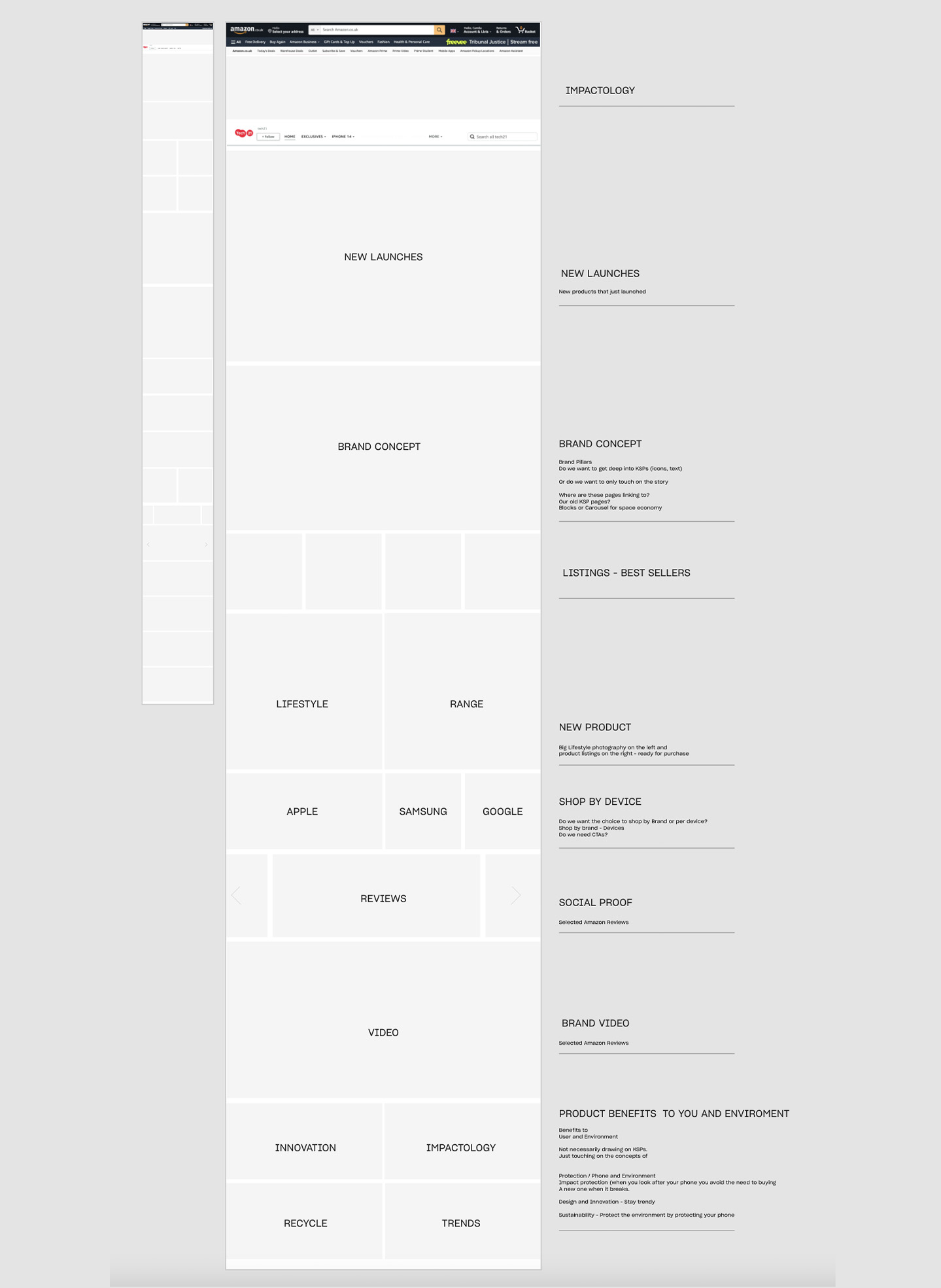
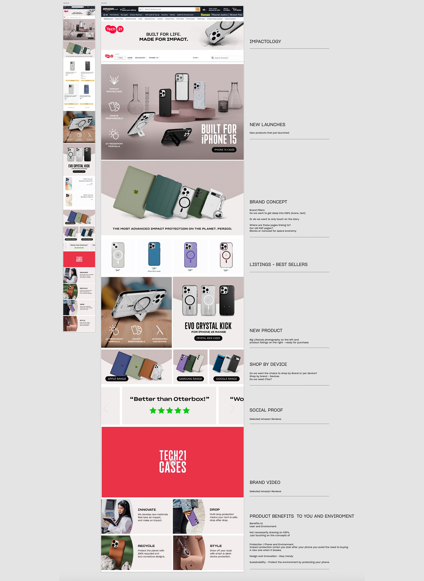
Final Structure

Solution: A Flexible and Adaptable Design Framework
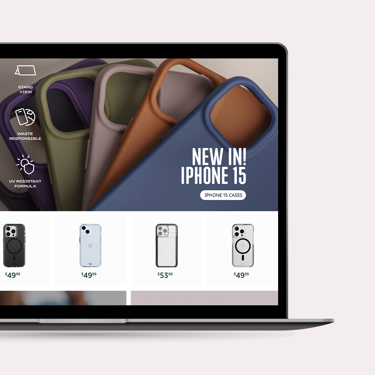
I designed each module to serve as a flexible template that can be easily tailored to meet specific brand preferences and content requirements. These templates come with pre-set layouts and compelling calls to action.
This module effectively combines lifestyle imagery, icons, and product ranges to address diverse needs. The carefully chosen images enhance relatability, the icons reinforce product features, and the showcased product range appeals to consumers, creating a well-rounded solution.
This approach enables the efficient customization of design elements and templates to suit various requirements while ensuring consistency and coherence in the overall design.
Design System
In crafting the Tech21 Brand guideline, my role extended to adapting our primary color palette, introducing accent colors, incorporating icons, and selecting font pairings for the Amazon platform. This process aimed to create elements tailored to our content and to enhance brand recognition.
These design elements, introduced during the revamp, have found applications beyond Amazon, extending to social media, the website, and various marketing materials.


Outcomes and Ongoing Developments
The enhanced flow has streamlined navigation to specific pages, resulting in a 43% increase in engagement since the implementation of the new design. We consistently leverage data and metrics to guide design decisions, making ongoing adjustments to meet demand.
Currently, our focus is on creating a central educational page that delves deeper into our main brand pillars: Impactology, Sustainability, and Innovation. Stay tuned for updates!
Selected Works

LuxPrime Hotels - UX case studyBooking Platform

Running App and BrandingBooking Platform

Tech21 Amazon Brand StoreE-commerce platform
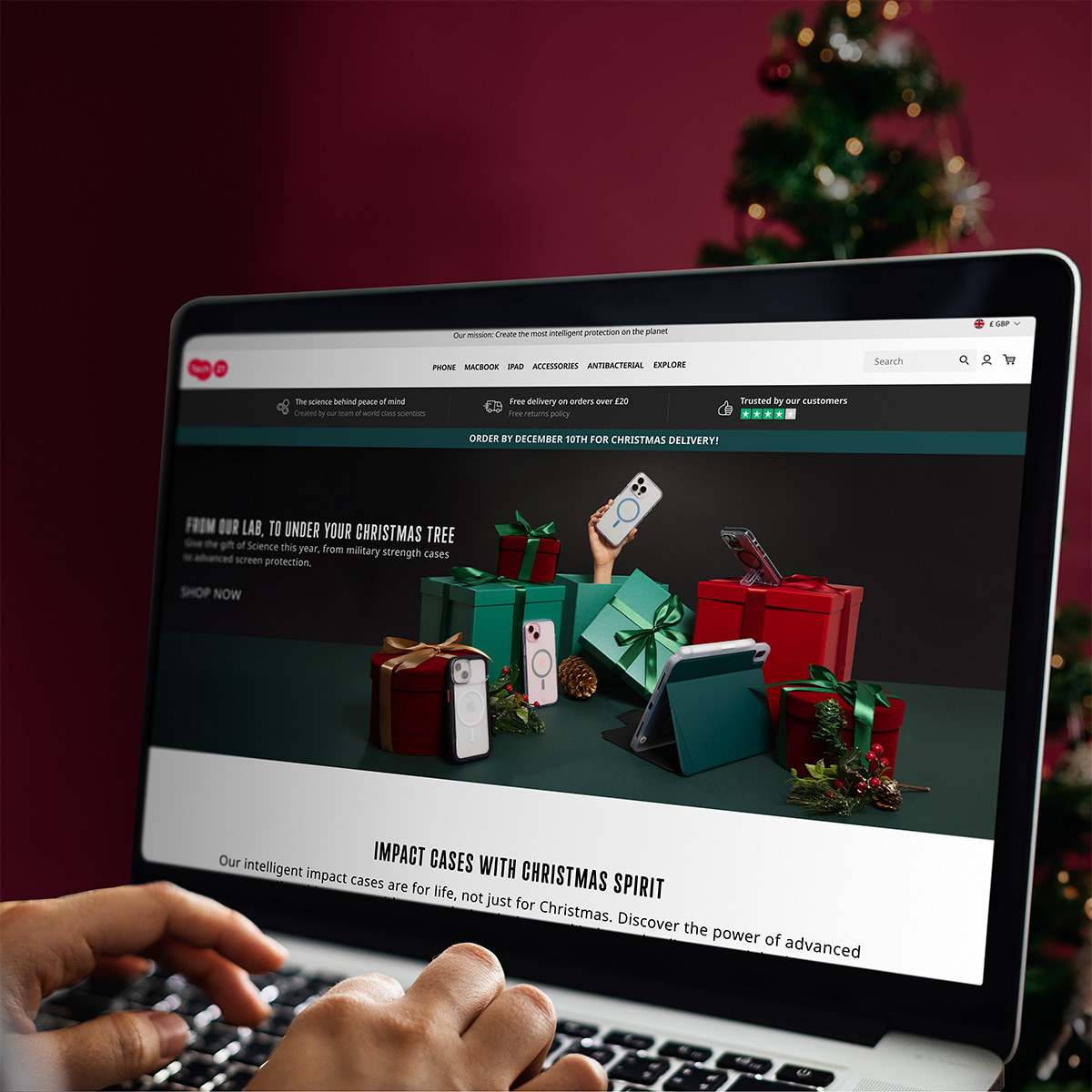
E-commerce Christmas CampaignE-commerce | Reatil website
