LuxPrime Hotels
UX booking system case study
Tools:
Figma
Miro
Notion
Zoom
Research | Analysis | Concept | Information Architecture | Prototyping | Interactions | Visual Design | Wireframing
Project background
This case study is a student project for the UX Design Institute. With the advent of Booking.com and its ease of use, several hotels have been losing sales. The room booking processes can be clunky and unfriendly, leading the user to aggregators' sites or competitors.
Objective
The objective of this project is to look into detail over hotel booking experiences and identify users' positive aspects as well as pain points to create an easy and smooth flow from browsing hotels to booking a hotel room.

The Challenge
How might we help hotels
to retain business via their booking system?
The Client
A luxury hotel chain competing against
aggregator sites.
Role
Product Designer:
End-to-end project.
Timeline
The project took 12 weeks to complete.
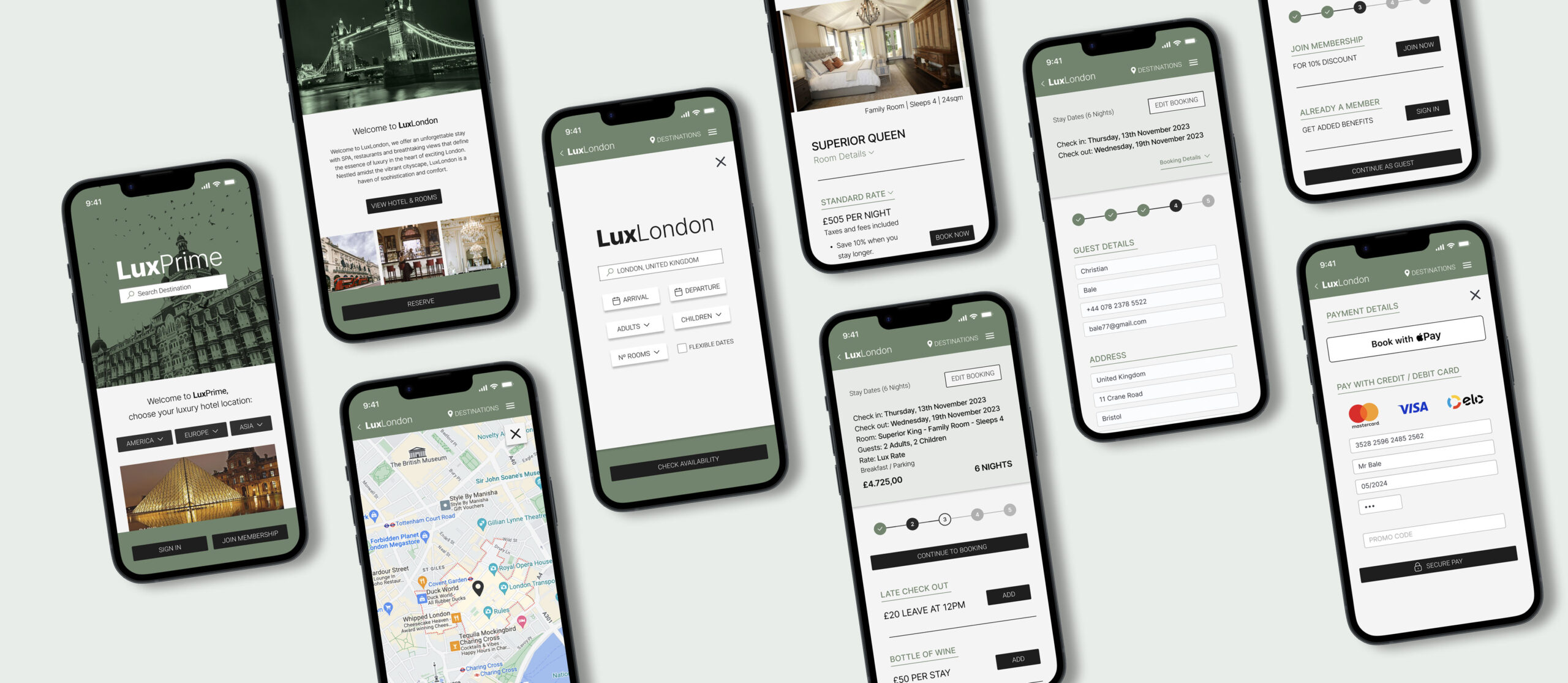

Research Goals
To investigate how users chose and booked their hotel stay I set up the following research goals:
• What devices do people normally research and book accommodation on?
• What is the primary aspect people look for on a website when booking a hotel?
• How do people conduct research on where and what hotel to book?
• How long is the exploration mode and how quickly do people book after they have made a decision?
• What website features are crucial in order to complete a booking seamlessly?
Research Method
Desk research
– Existing articles/studies
– Competitive landscape
Primary research
– Interviews with travel website/app users
– Survey: (Quantitative research) via Survey Monkey
- Usability Tests on Competitor sites
Quantitative and quality research: Defining the problem
I conducted an online survey to understand user behavior on hotel and aggregator platforms. Findings show a preference for direct hotel bookings for easy cancellations and personalised requests. However, users often turn to third-party sites like Booking.com for perceived user-friendliness, cost savings, or when frustrated with the booking process in hotel websites.
3
Interviews
3
Usability Tests
40
Survey Responses
‘I think because I have a loyalty thing with Booking.com I tend to use them more as I think I am getting a better price.’ - Quote from user interview.
Competitive Landscape
When examining well-known, London luxury hotels, I identified issues like unclear language, missing information, and confusing structure. Here are some of the hotel websites benchmarked.

Remote usability test performed on mobile - Part 1
Usability Testing - Competitors
Some of the main insights the survey, interviews, and usability test revealed:
• Comprehensive facility descriptions play a pivotal role in decision-making processes.
• Social proofing holds significant importance in influencing hotel booking decisions.
• The Calendar feature bears substantial weight in shaping the user experience and must be thoughtfully crafted.
• Rates and cancellation policies, often sources of confusion, demand extra attention for clarity and user understanding.

Affinity Mapping
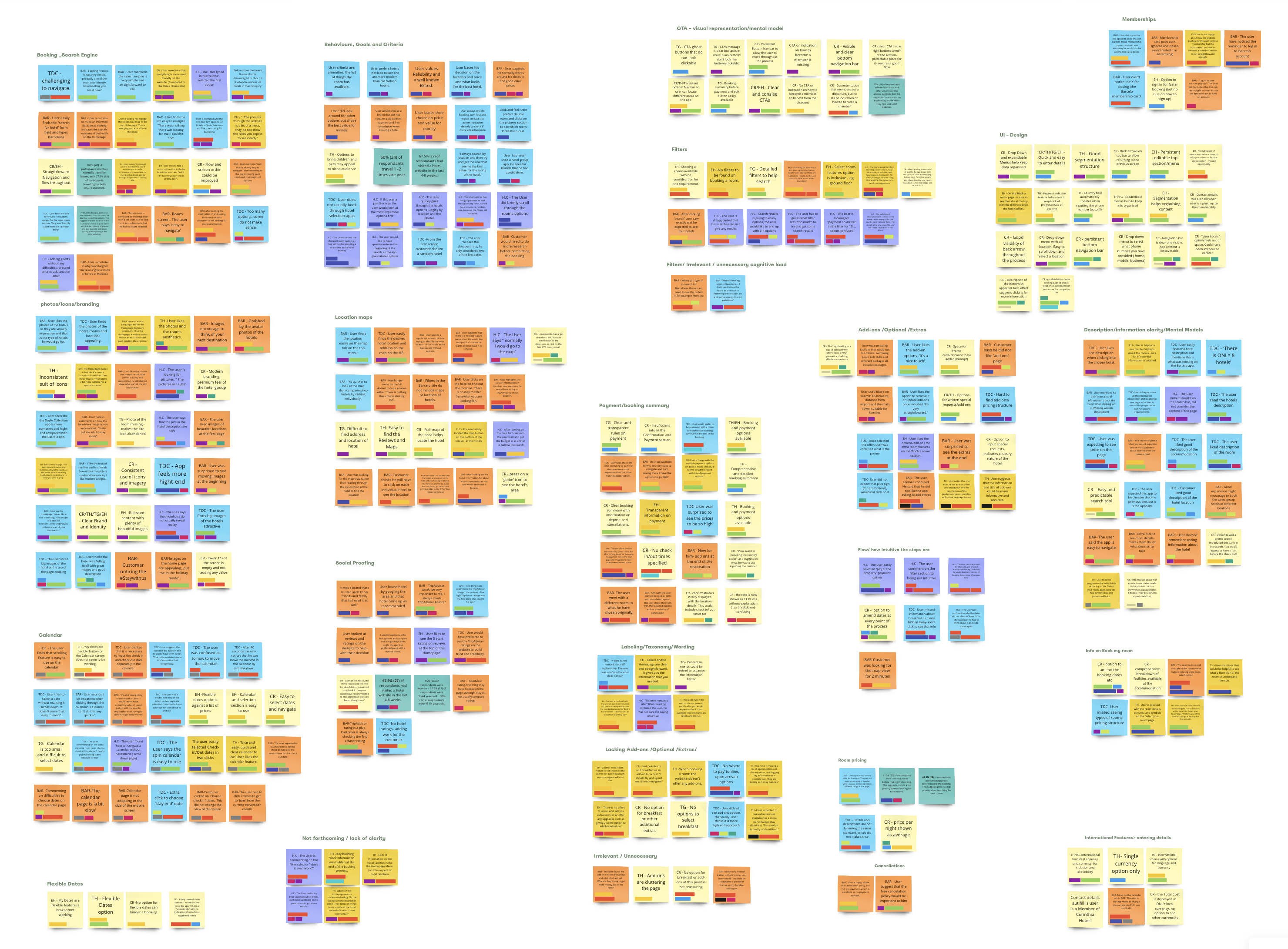
I conducted several affinity diagram sessions to categorize and make sense of our data, enabling us to identify actionable steps toward our project goals. This collaborative analysis, in partnership with another UX Designer, ensured a more comprehensive understanding of our insights.
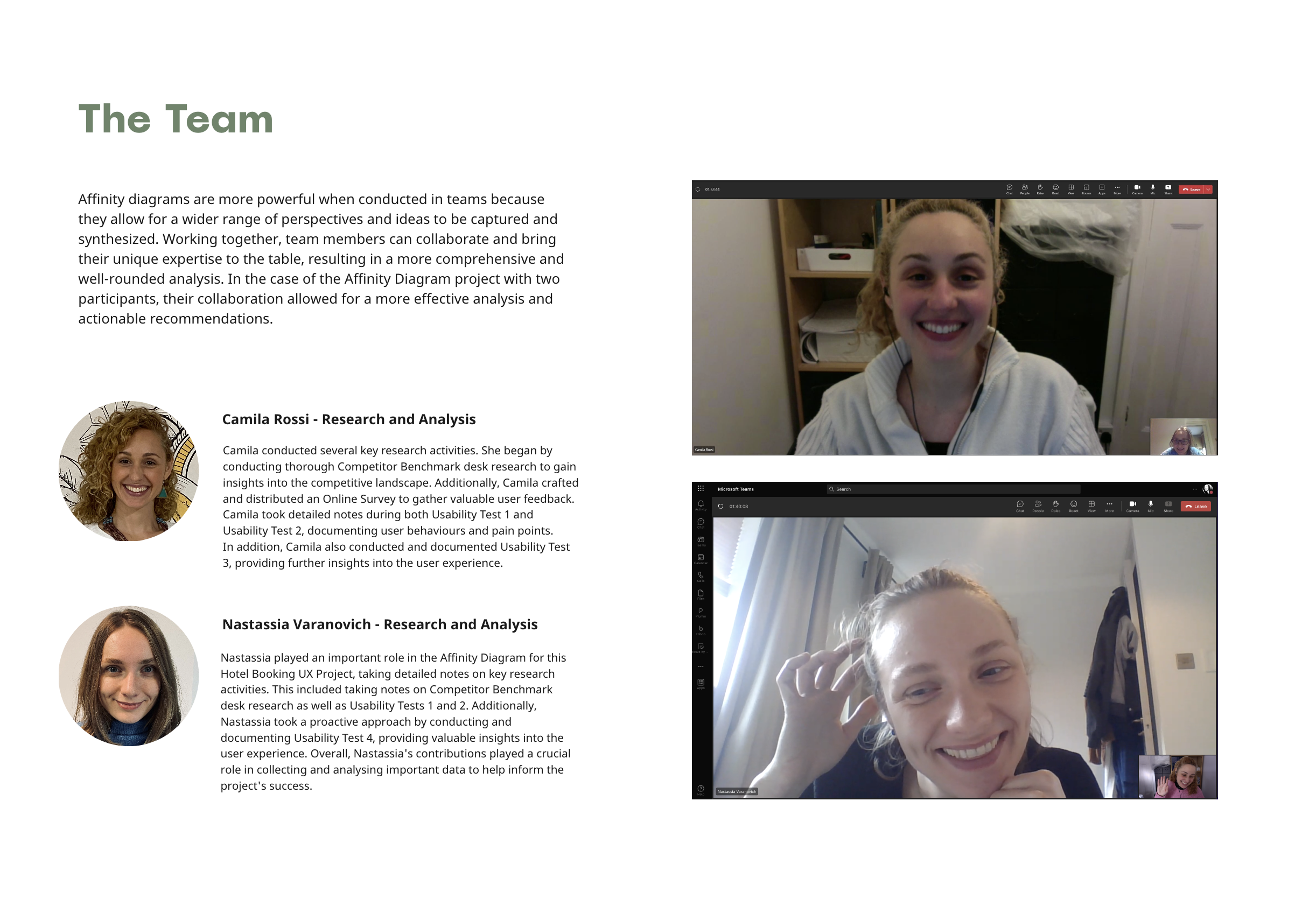
Team workshop and Affinity Diagram grouping in Miro
Customer Journey Map
I translated all the research data into a structured Customer Journey Map, which delved into user personas and scenarios, tracking their emotional experiences from considering a booking to completing it. This map aligned with the user's context, mental models, behaviors, and goals at each stage of the journey.
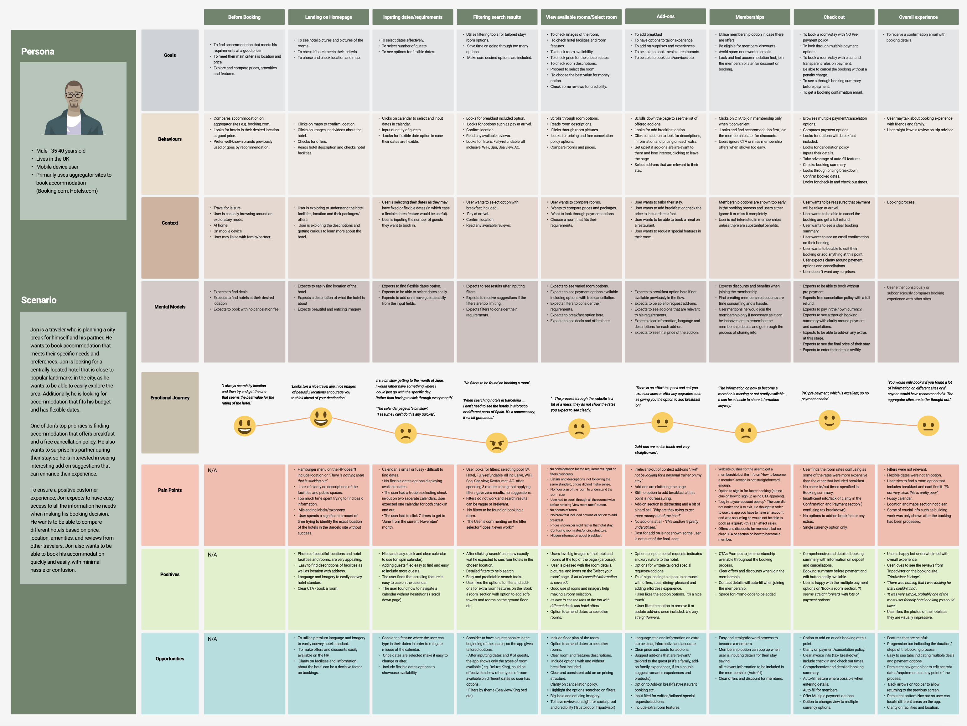
Costumer Journey Map in figma
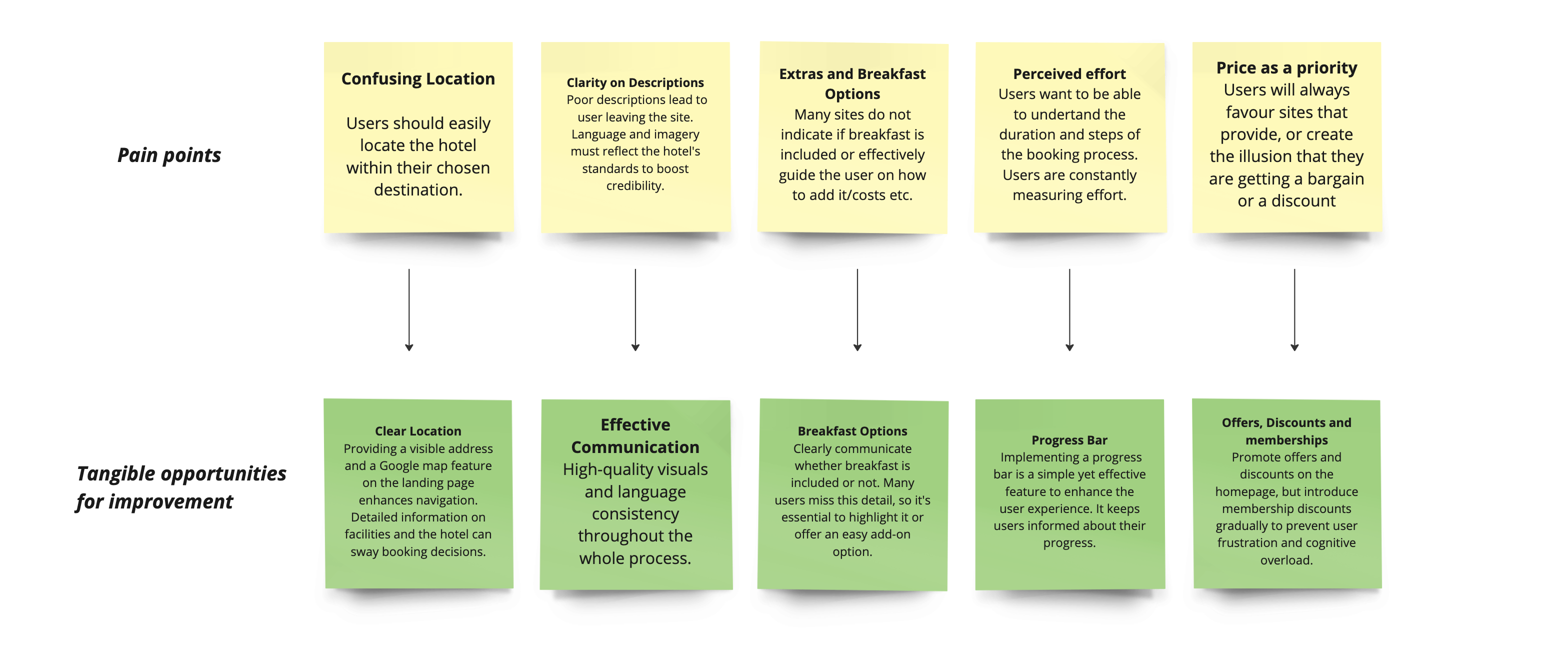
The Customer Journey Map uncovered valuable insights to improve the booking process and highlighted the pivotal role of communication, branding, and language, both written and visual. Above are some of the highlights of the opportunities discovered.

Flow Diagram: The Happy Path
Analysing findings from the Affinity Diagram and Customer Journey map, I honed in on issues and opportunities. This process refined the information architecture, leading me to a 'happy path' to create a more seamless and efficient user experience.
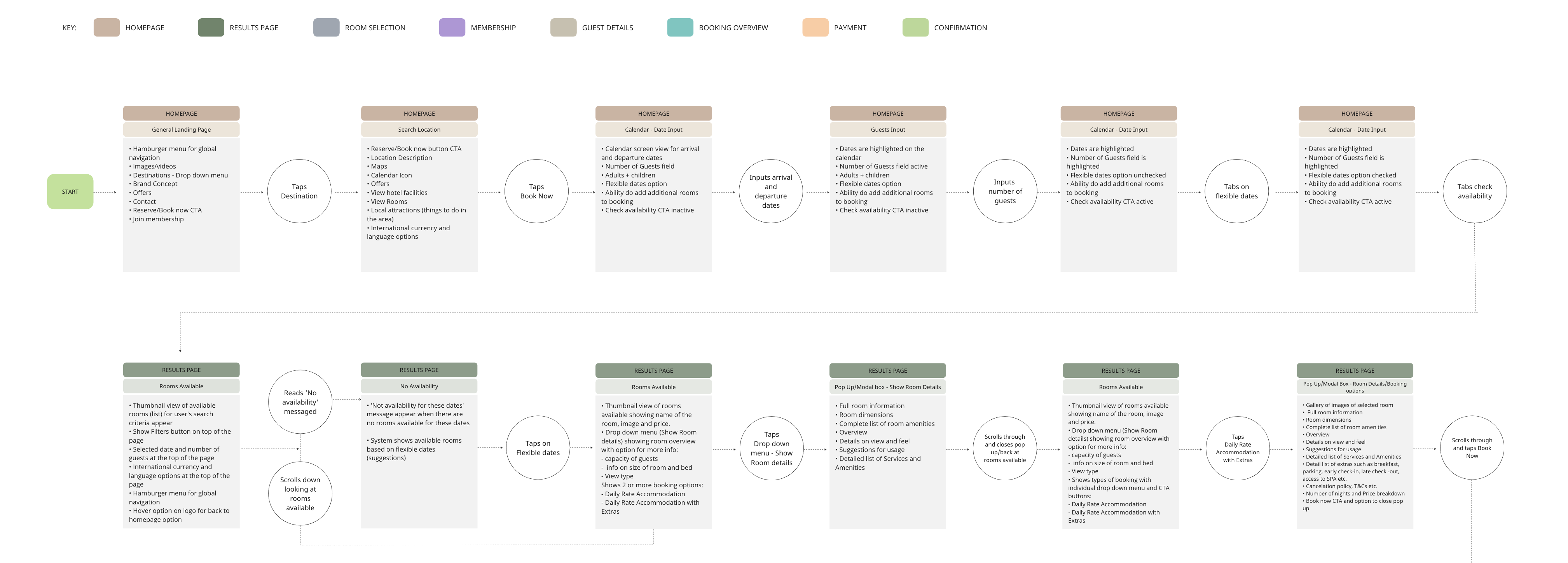
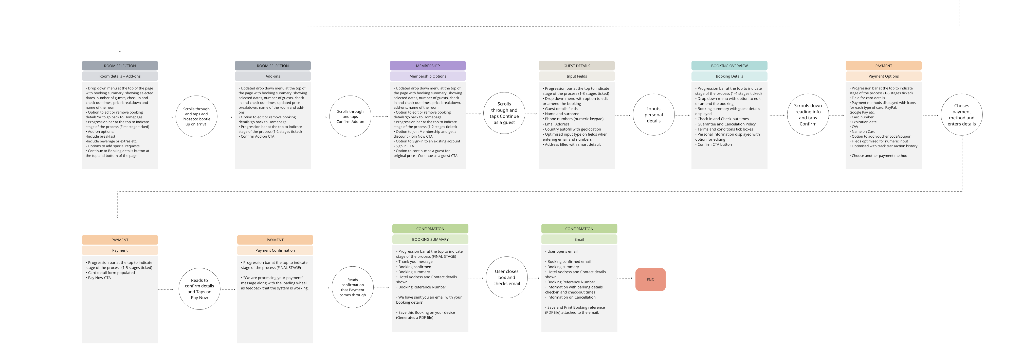
Flow diagram - 'Happy Path' in Miro

Interaction Design
I have sketched screens to test the interaction flow, representing the user's journey through the booking process. After testing various sequences, I arrived at a seamless path, prioritizing the user's happy path for this project.
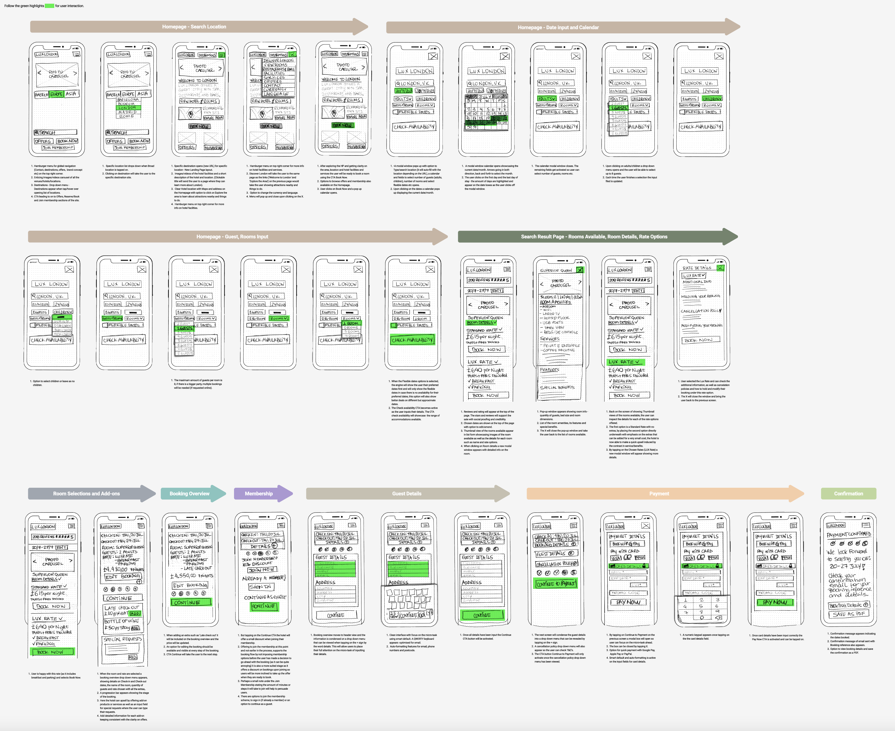
Interaction Design - in Figma

Prototype
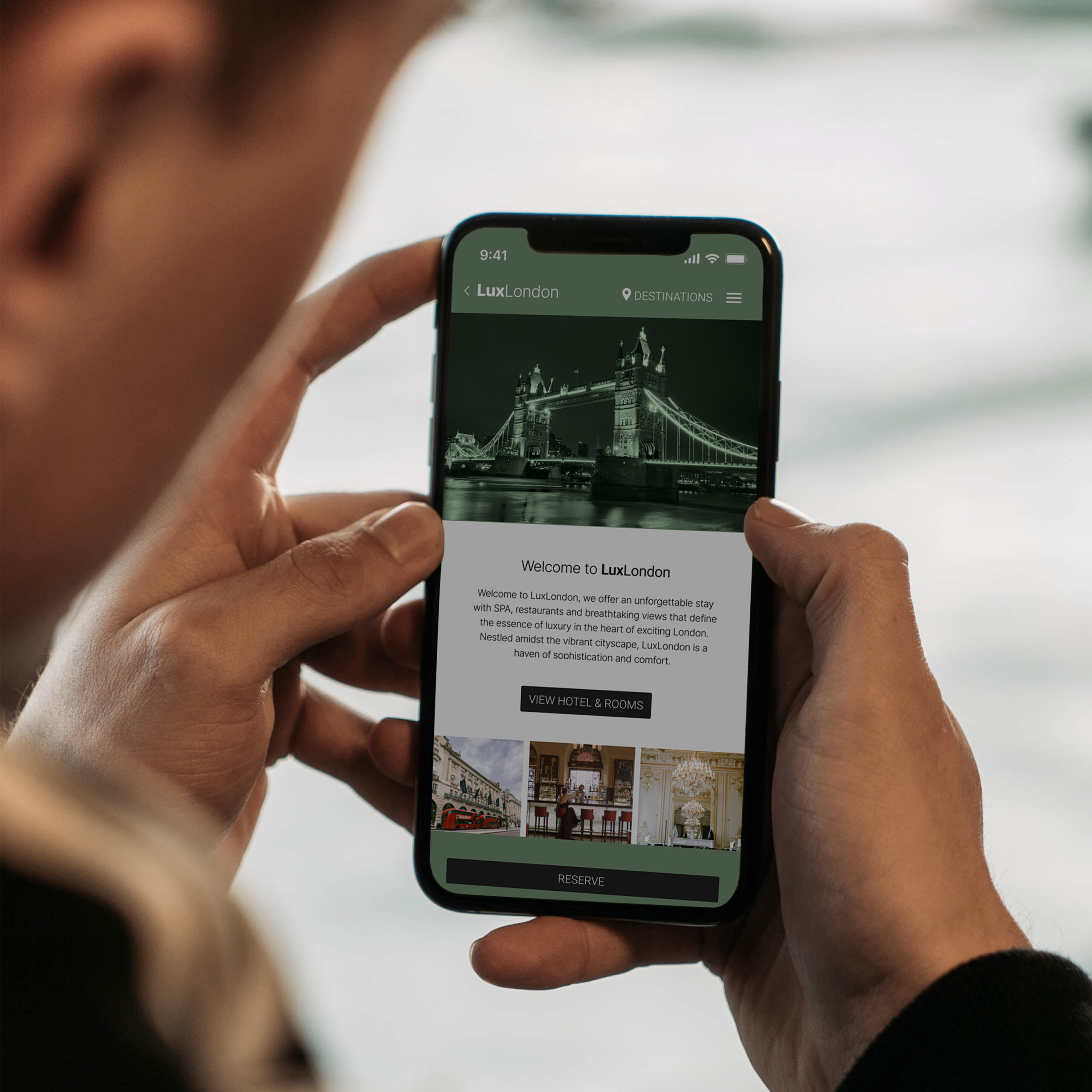
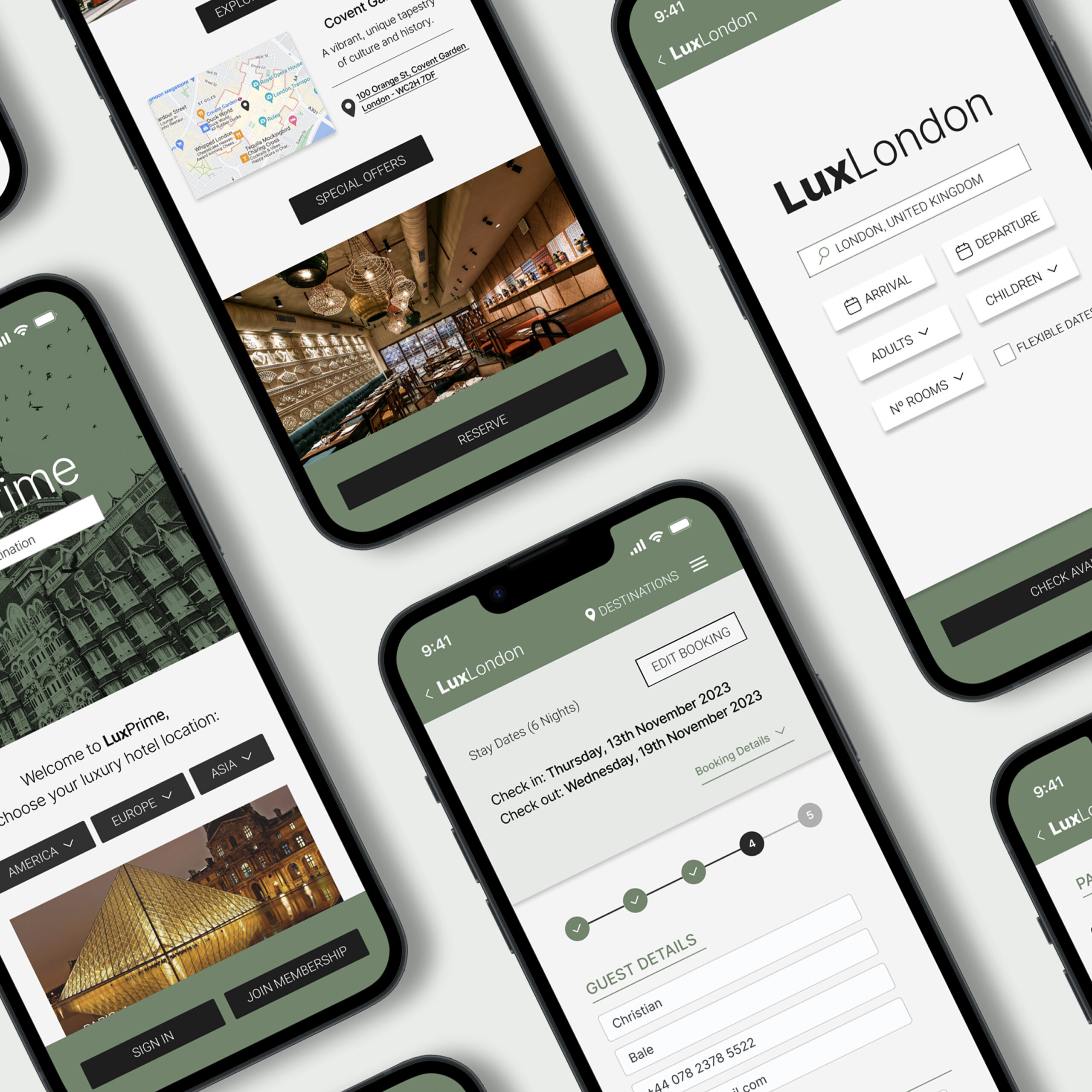
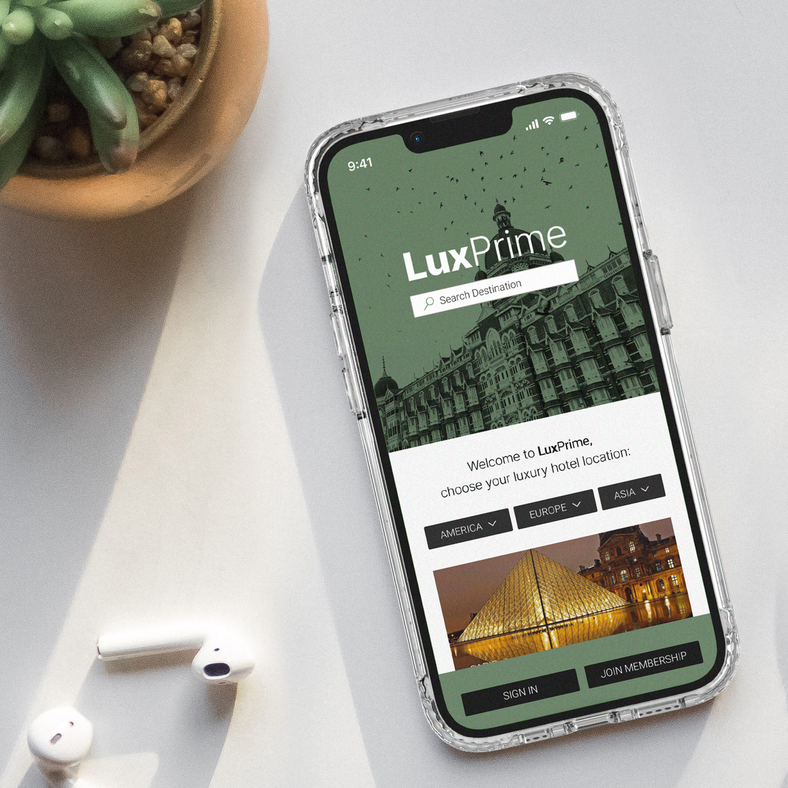
Here is a medium-fidelity prototype focusing on the happy path with some interaction.
Prototype usability test brief in figma:
Destination: London
Date: 13 -19 November
Guests: 2 adults and 2 children
1 Room
Room: Superior King
Rate: Lux Rate (check the details)
Add: Late Checkout
Continue as a guest
Pay by card
Reflections: What have I learned?
This case study provided me with a rich array of insights that have significantly contributed to my learning. Perhaps the most relevant lesson stemmed from the experience of usability testing, where observing users' interactions with the product provided deep insights beyond my initial assumptions about shared mental models.
This iterative process reinforced the notion that effective UX design is inherently human-centric and that incorporating conventions and design principles to a continual commitment to enhancement is what ensures we stay in the right direction to achieving effective products.
In addition, the case study illuminated the critical role of social proofing in shaping user decisions. Understanding that users base their choices on a diverse array of criteria, this revelation emphasised the importance of a comprehensive approach when designing user flows and interactions. It highlighted the need to account for various factors to create a more holistic and user-centered experience.
In reflection, the case study reinforced the significance of teamwork and constructive feedback in the UX design process. While usability tests are indispensable, collaborative efforts and thoughtful discussions emerged as equally crucial elements in crafting a successful product. This holistic approach, combining insights from user testing and collaborative design, forms the foundation for creating products that truly resonate with users.
Selected Works

LuxPrime Hotels - UX case studyBooking Platform

Running App and BrandingBooking Platform
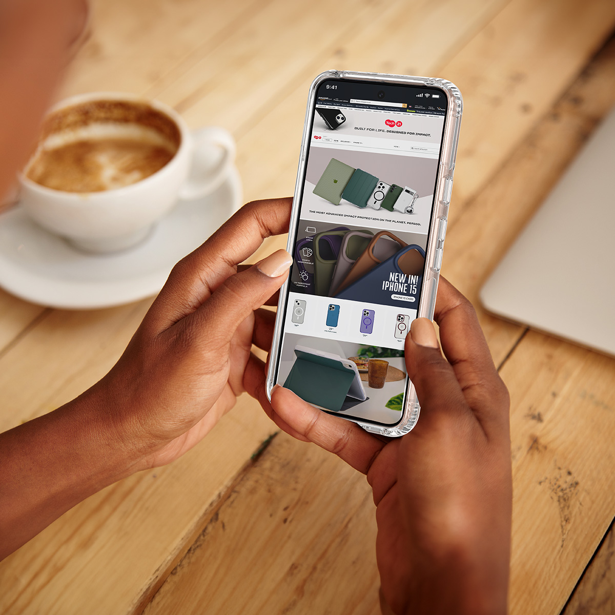
Tech21 Amazon Brand StoreE-commerce platform
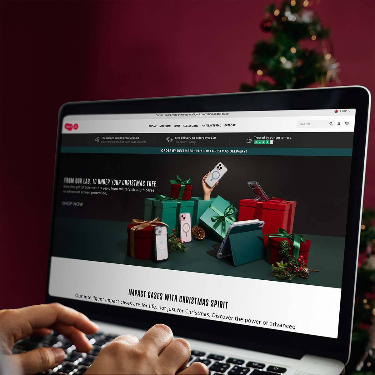
E-commerce Christmas CampaignE-commerce | Reatil website